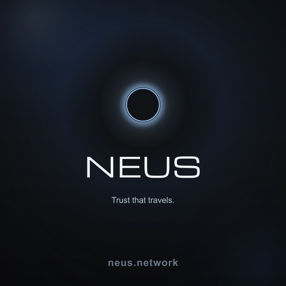
Brand
NEUS Brand Guide
This guide covers color, typography, and official assets for the NEUS brand.

Color
A dark field, a single blue accent, and quiet grays for structure. Enough range to feel premium without visual noise.
NEUS blue
Calls to action, focus, highlights
#98C0EF
Obsidian field
Pages and immersive backdrops
#101113
Steel line
Separation with restraint
#5A5A5A
Typography
Confident headlines. Calm supporting lines.
Mona Sans carries the product, docs, and marketing UI. Michroma appears only in OG cards and downloadable brand-pack lockups.
Technical labels stay in Mona Sans at small sizes so the story stays human. The result should feel engineered and quiet, not like a template deck.
Surfaces
Depth you feel, not decoration you notice.
Interfaces use soft glass and neutral elevation so content leads. Accent blue is for moments that matter: actions, emphasis, and trust signals, not every border and frame.
Corners and shadows follow one family across the product so marketing, product, and print all feel like the same company.
Kit contents
Logos, icons, and manifests included in the zip. Tap a row to download.
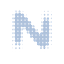
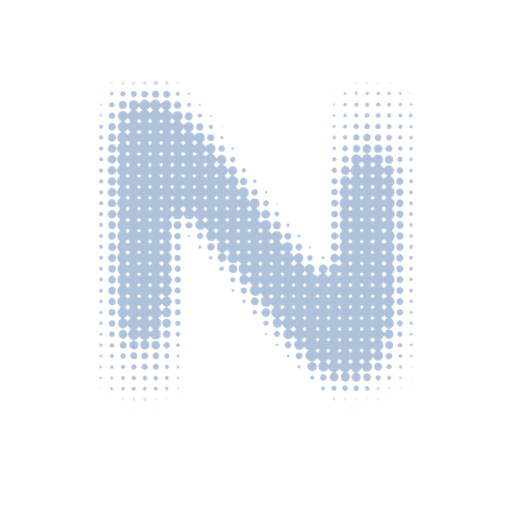
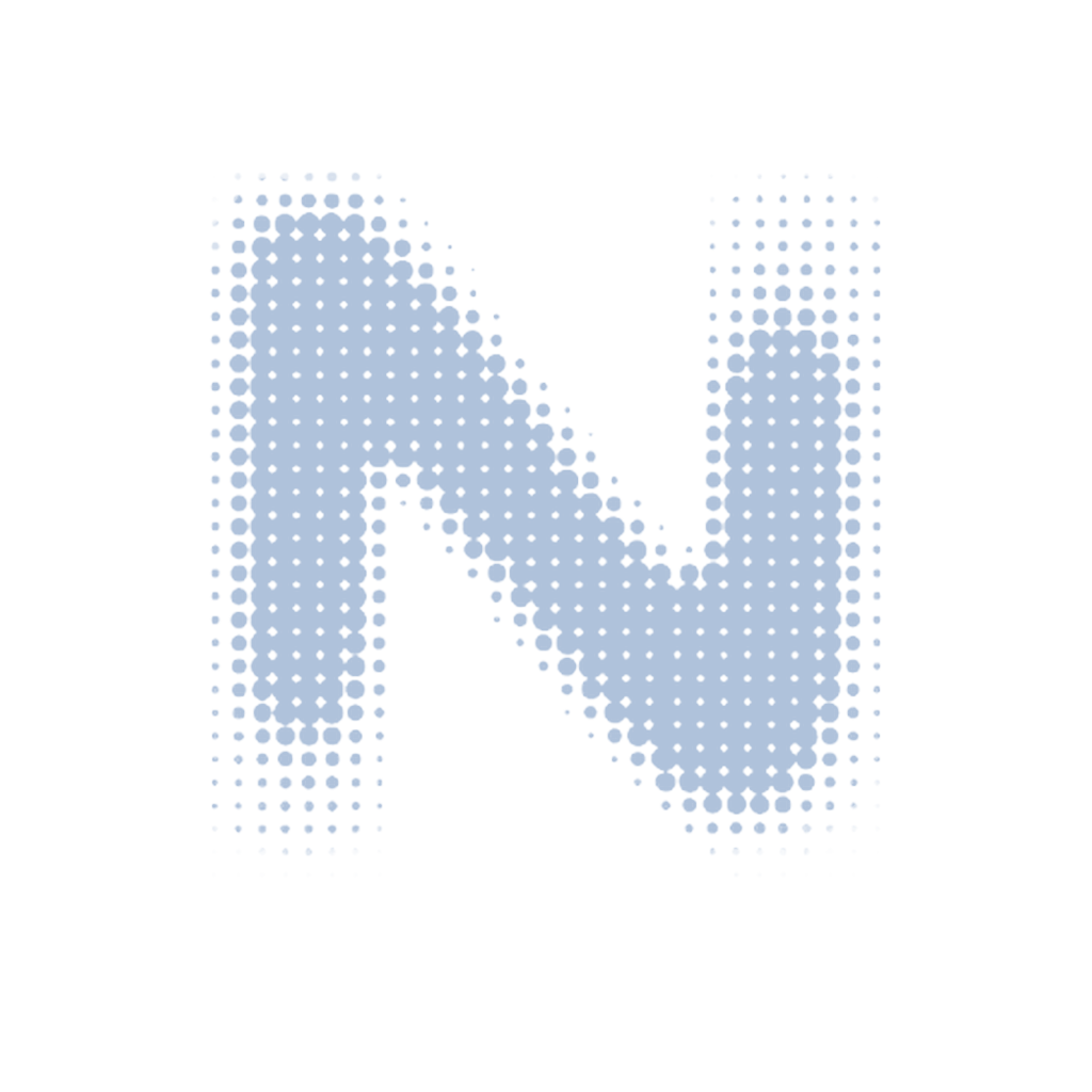
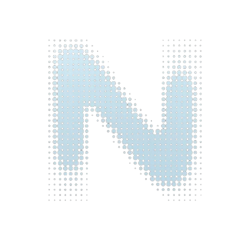
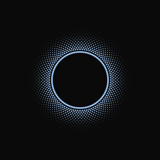
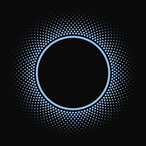
- Mark (SVG, vector)
- Mark compact (SVG, tabs / small UI)
- Mark white (SVG)
- Mark ink for light backgrounds (SVG)
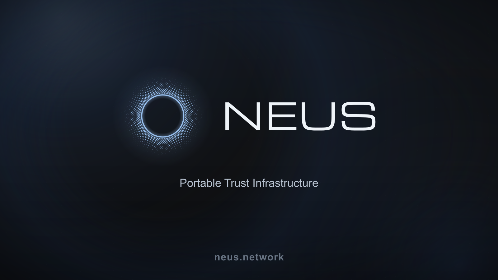
- Logo lockup (SVG)
- Stacked lockup (SVG)
- Mark 128px
- Mark 256px
- Mark 512px
- Mark 1024px
- Mark white 512px
- Android chrome 192×192
- Android chrome 512×512
- Maskable icon 512×512
- Apple touch icon
- favicon.ico (16/32/48)
- favicon.svg
- Mark 256px (app / wallet metadata)
- Open Graph (1200×630)
- Social wide (1600×900)
- Social square (1080×1080)
- Social header (1500×500)
- Newsletter header (1600×640)
- Business card back (1050×600)
- Social avatar (512×512)
- Brand tokens (JSON)
- Web manifest