Brand Identity
GuidelinesVer 2.02026
Defining the visual language for the portable proof layer.
Minimalist. Borderless. Secure.
Defining the visual language for the portable proof layer.
Minimalist. Borderless. Secure.
A code-derived guide to NEUS visual identity: tokens, typography, color, grid, and iconography.
Unlike traditional social platforms, Neus is a private verification layer. Our design reflects this: enclosed, protected, and calm. We avoid loud gamification in favor of clarity and precision.
The verification data is the hero. The interface recedes. We use deep canvas tones (#121314) and subtle glass surfaces to create depth without relying on heavy borders or skeuomorphism.
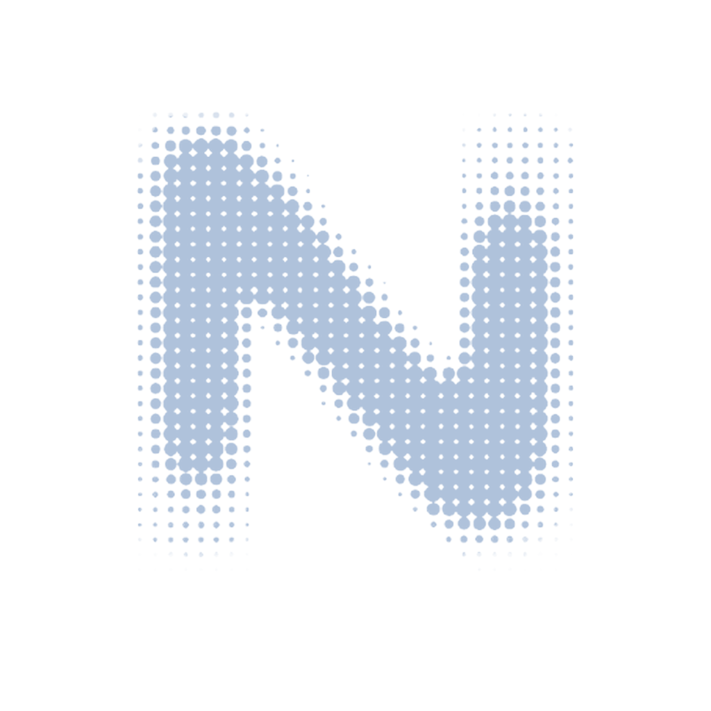
Neus Mark (Logomark)
Use on all dark backgrounds
Geometric letterforms, custom N interpretations, and negative space designs
Abstract shapes representing proof, verification, trust, and network concepts
N combined with shields, hexagons, portals, and other brand elements
Full NEUS typography and icon+wordmark lockups
Gradient treatments, solid colors, and mono versions for different contexts
Our palette is derived from deep interstellar space. We rely on three primary dark shades to create depth and hierarchy without borders.
Blue is precious. It is used strictly for actionable items, primary inputs, and verification status. Never for decoration.
Void Canvas
Main Background
Rail / Surface
Sidebars & Panels
Card / Elevation
Cards & Modals
Cloud Blue
Primary Brand / Accent
Signal Success
Verified / Complete
Signal Error
Failed / Destructive
The universal interface typeface.
Designed by Rasmus Andersson
SIL Open Font License 1.1
64px / Bold
Tracking: -0.02em
Hero headers and major splash screens.
Proof of Everything
32px / SemiBold
Tracking: -0.01em
Section headers and modal titles.
Verification Complete
16px / Regular
Tracking: 0em
Default body copy for reading.
Neus is a portable proof layer that allows you to own your reputation across the decentralized web.
13px / Medium
Tracking: 0.0em
Code snippets, transaction hashes, and technical data.
0x71C...9B2d // VERIFIED_TRUE
All spacing, sizing, and typography line-heights in Neus are divisible by 4. This creates a subconscious rhythm and mathematical harmony across the interface.
0.25rem (4px)
0.5rem (8px)
1rem (16px)
2rem (32px)
We use Lucide React for consistent, crisp, and lightweight iconography. Icons should be used sparsely to aid navigation, not for decoration.
1.5px Stroke
Standard weight
2px Stroke
Active / Emphasis